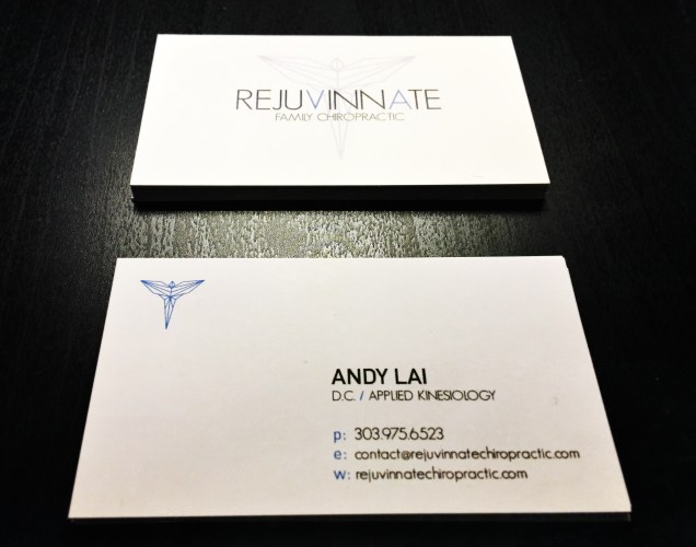
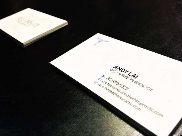
My brother and his girlfriend recently opened their own chiropractic practice in Denver. All the hard work and logistics into starting a new business is a feat in itself, so I wanted to help by creating/designing their identity and branding. After much brainstorming, we decided to take the chiropractic angel and put a modern interpretation to it. The thin straight lines, light condensed sans serif font and symmetry of the logo represent balance, comfort and tranquility. A neutral, calming shade of blue was chosen to reflect trust, calmness and peace for the mind and body. Since the first letters of my brother and his girlfriend’s names start with an “A” and “V” and are in the name of their practice, it was fitting to highlight those letters in blue. A lot of white space was used in creating the business cards to continue the same feel and look of their identity. All in all, we were all very happy with the results. Expecting a successful future for Rejuvinnate Family Chiropractic, I look forward to and am excited to help expand their brand! Congrats to Andy and Victoria and all my best to you!