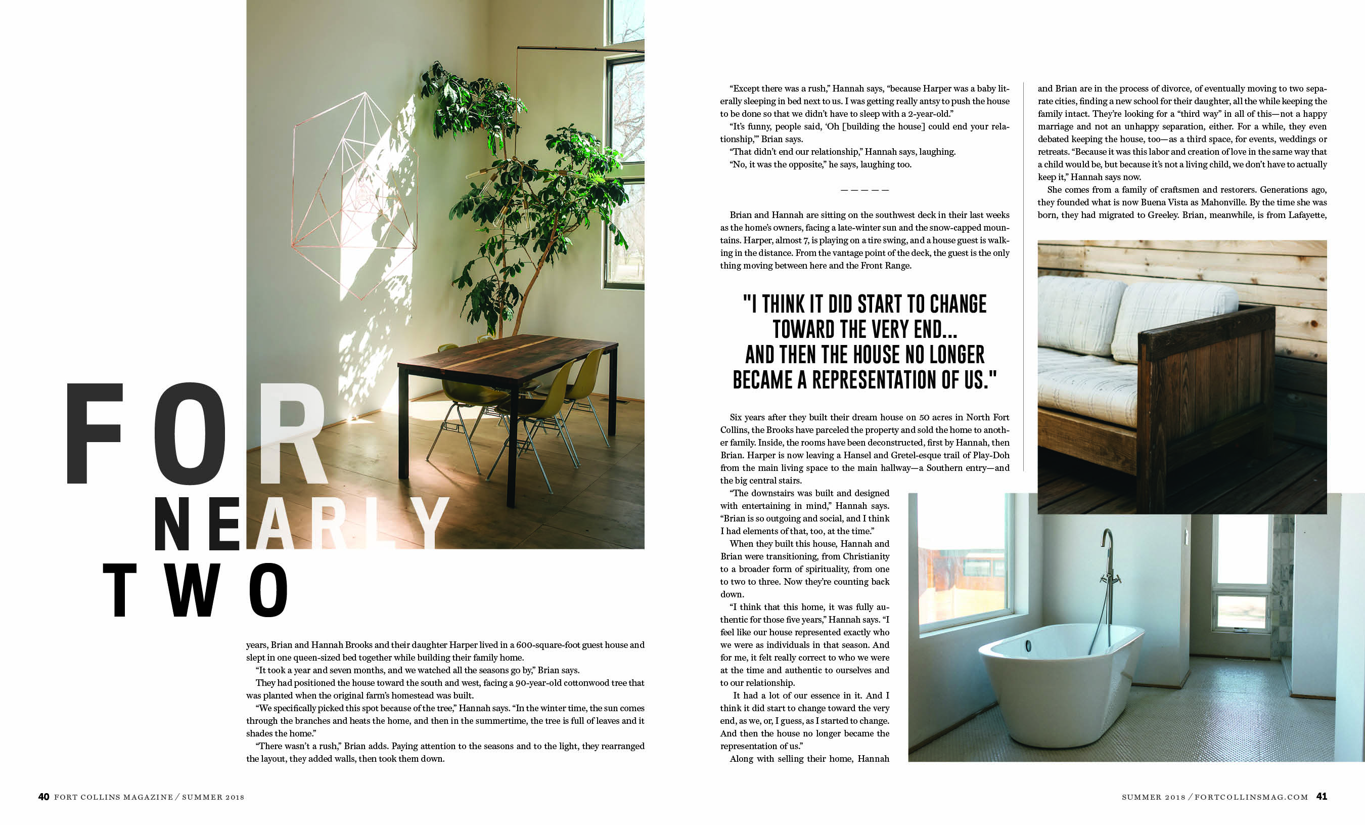
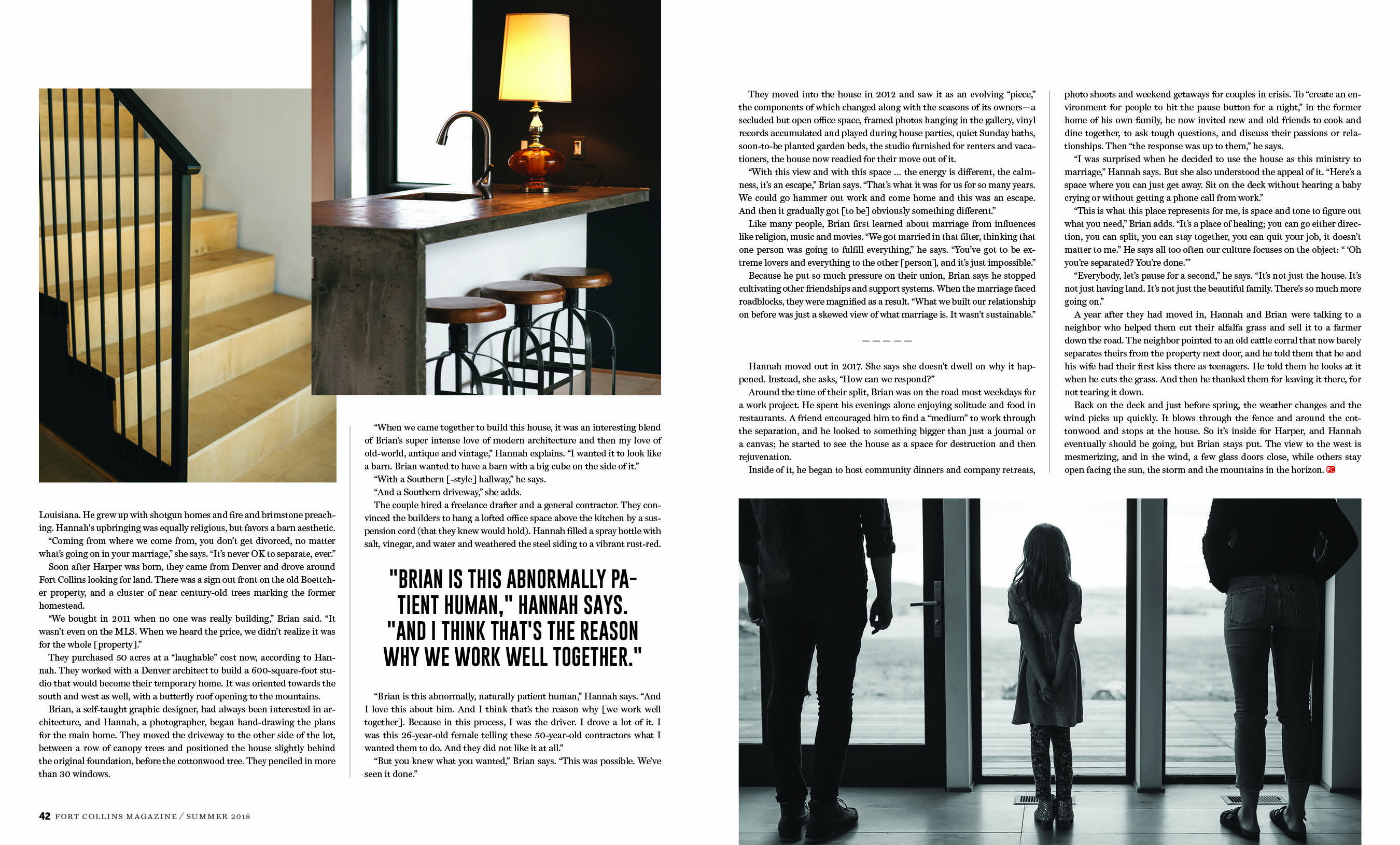
This year, I was given the opportunity to design the marketing materials for the Asian Film Festival of Dallas (AFFD). They were open to a complete redesign and gave me creative freedom – what designer doesn’t love that? It was a demanding schedule, but I was up for the challenge!
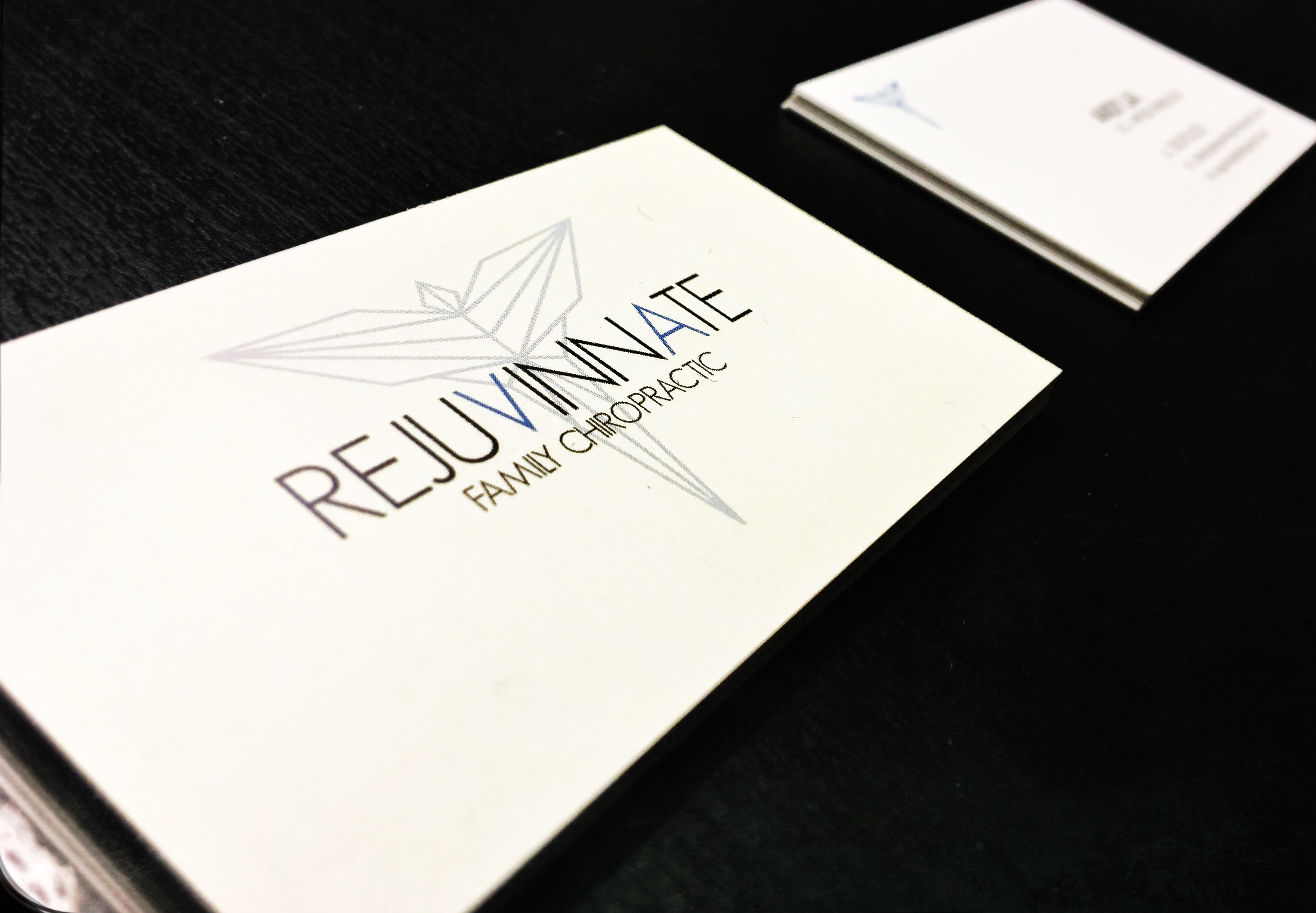
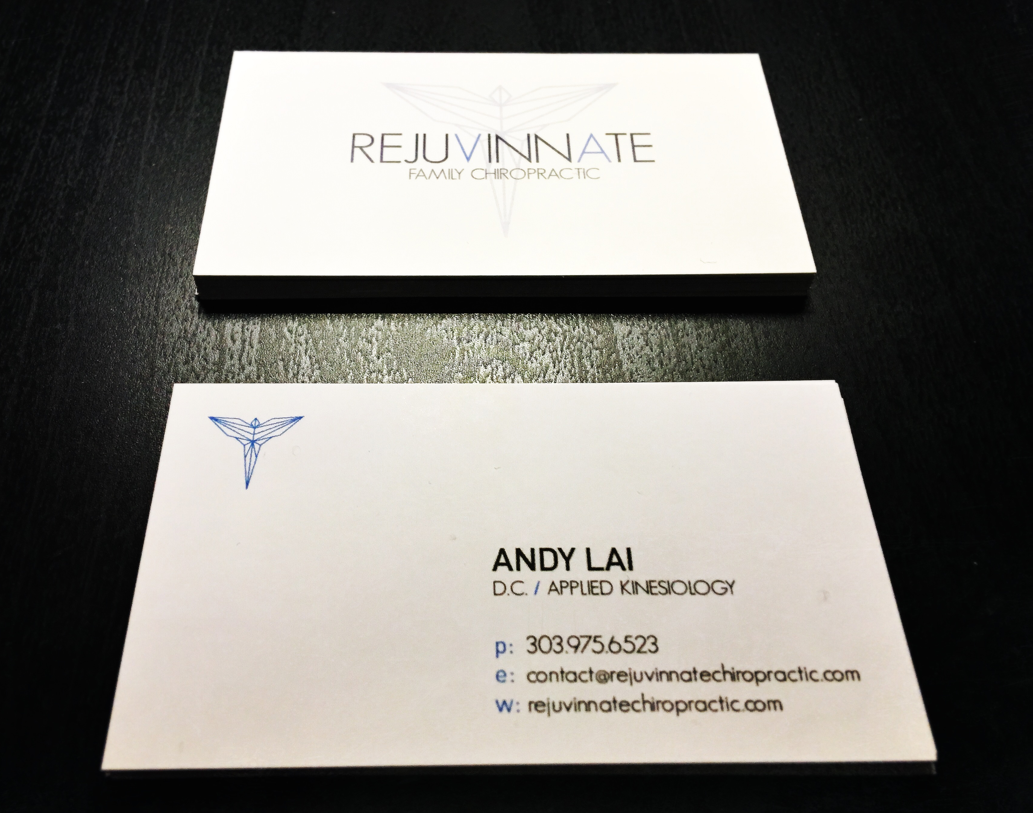
The first thing I did was update the logo, giving it a clean, contemporary look. I chose new fonts, along with a new color palette (primary: black, white, grey; secondary: red, gold). These styles were then extended to the website and promotional videos for AFFD.
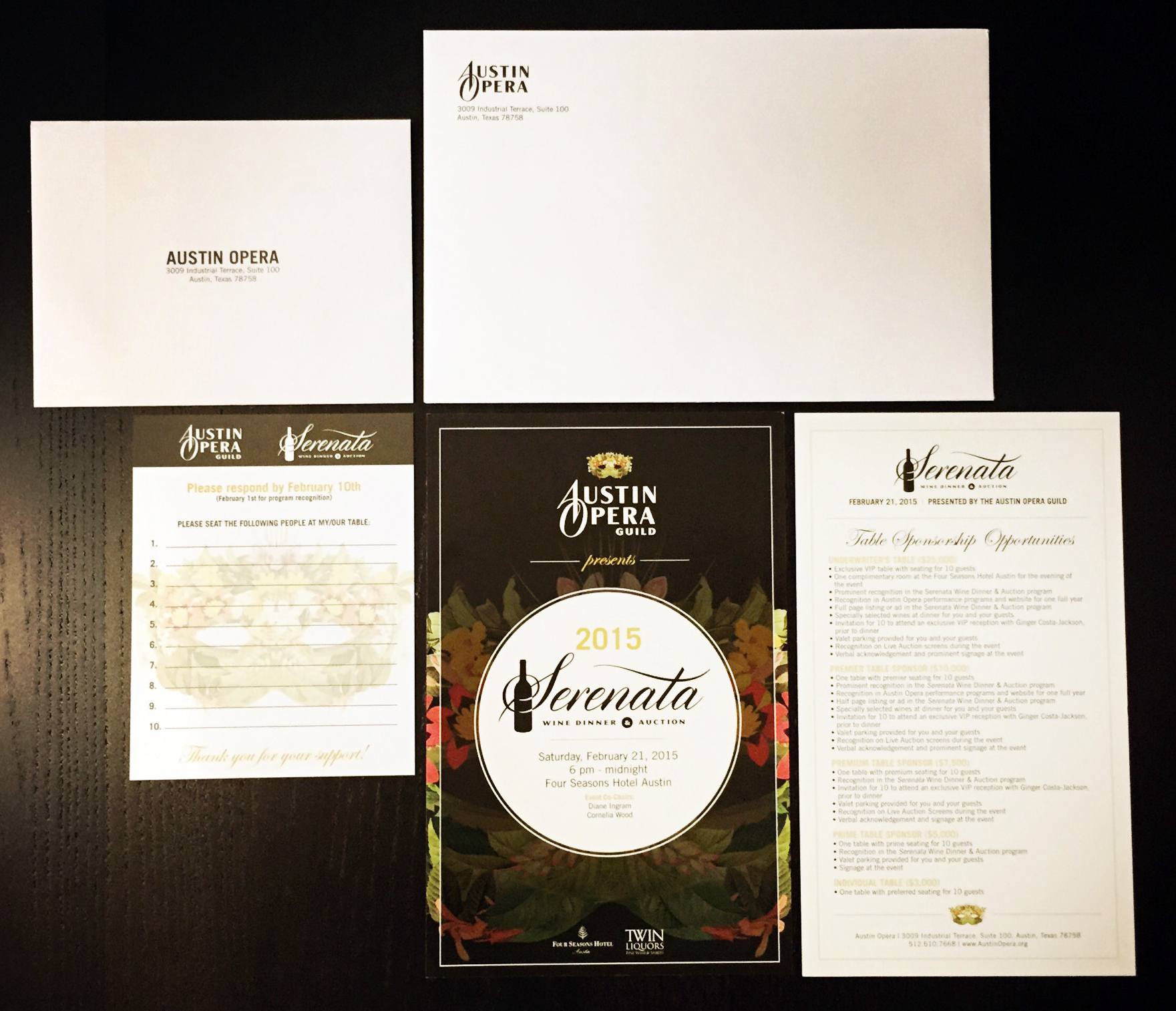
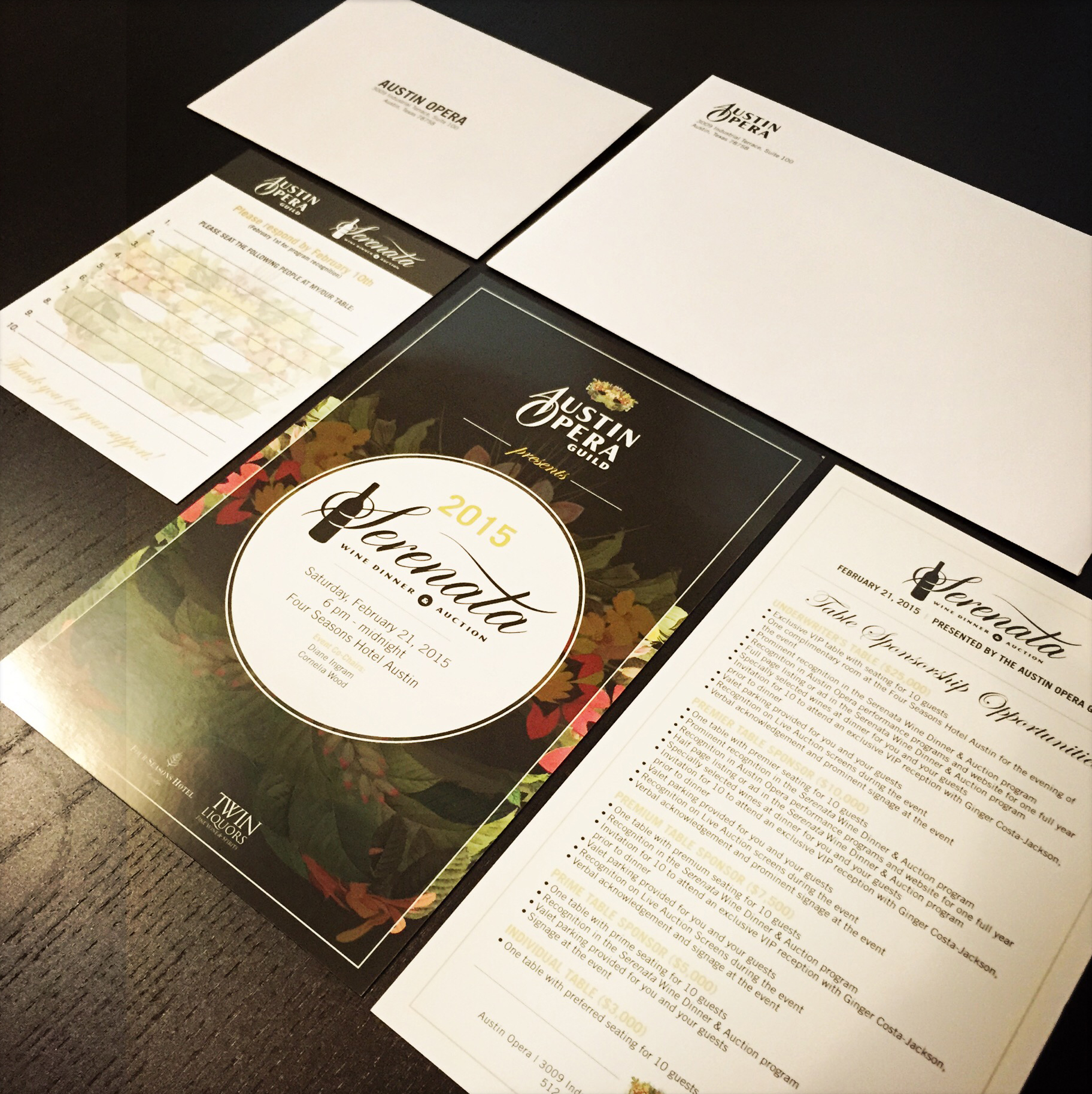
With all the changes and updates approved, I started on the festival program. This, too, received a healthy redesign: from the cover, front of book pages and ad placement, to special section pages, program schedule and film reviews. Response to the new cover layout was overwhelming, but I was even more pleased with AFFD‘s reaction to the new layout of the film reviews and program as a whole. I wanted the reviews to be easy to read, and eye-catching at the same time. With this in mind, compelling movie stills were placed at the top of the page to grab the reader’s attention. Since there was a lot of info for each film, it made sense to lay it all out in a grid-like format. This made it easier to read. Another thing I added was the special premier labels to let festival goers locate premiere films more easily. Once I redesigned the festival program, I then updated the look of AFFD’s VIP badges, flyer, poster, vouchers, ballots, Facebook profile images, and T-shirts.
Fortunately, I was able to attend the festival this year to see all the new marketing materials in person and, finally, to meet the new people I’d been working with. All in all, I think everything was well-received and came out nicely.
If you “love subtitles” like I do, the Asian Film Festival of Dallas (AFFD) runs through July 21st, so it’s still not too late to check it out!

AFFD Marketing

Poster

Festival Program

T-shirt

Planning the program with awesome handwriting.

Flyer

Festival Program

VIP Badges

Vouchers and Ballots

Festival Program


![FullSizeRender[1]](https://i0.wp.com/ohmyfreakingoodness.com/wp-content/uploads/2016/07/fullsizerender13.jpg?w=420&h=287&ssl=1 "FullSizeRender[1]")
![FullSizeRender[2]](https://i0.wp.com/ohmyfreakingoodness.com/wp-content/uploads/2016/07/fullsizerender23.jpg?w=208&h=142&ssl=1 "FullSizeRender[2]")
![FullSizeRender[1]](https://i0.wp.com/ohmyfreakingoodness.com/wp-content/uploads/2016/07/fullsizerender15.jpg?w=169&h=127&ssl=1 "FullSizeRender[1]")