In A Blink Of An Eye, It’s Breckenridge and Winter Park Winter Issues Again!

And… of course, we’re in the middle of Spring and I’m just now posting the Winter issue! But hey, better late than never right? I really loved how the home features and guides turned out. If you like what you see, check out shelleylai.com to see more of my work!

Breckenridge and Winter Park Come Together

As we all know, last year was just all over the place, so I held off on posting. Right before the pandemic, we published a dual sided issue featuring Breckenridge and Winter Park magazines. Here are a few layouts from it.

Reasons to love North Colorado!

Check out the latest Spring and Summer issues of Fort Collins Magazine.

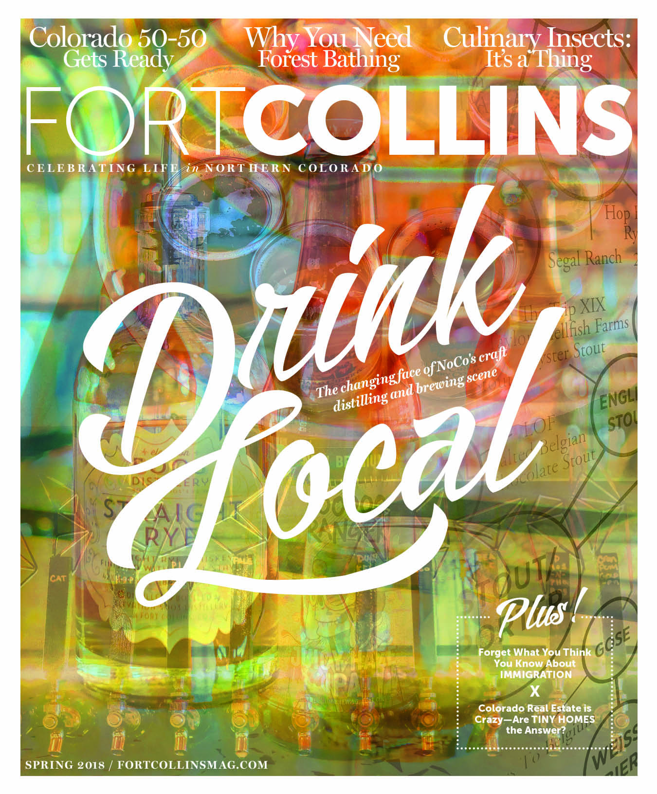
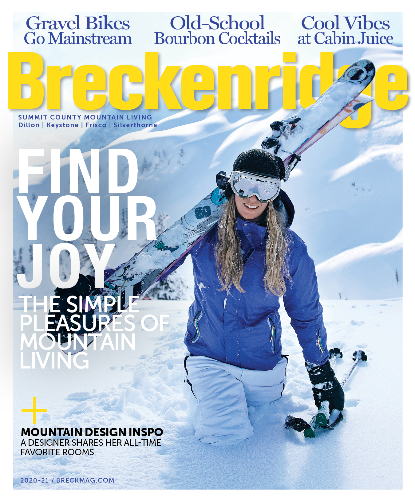
This was the first time Fort Collins magazine did something super abstract for their cover. The Spring cover has at least five different images in it with a typography treatment on top of it. To give it a fun spring-like feel, I went for warm bright colors; but at the same time, kept some earthy-tones to reflect the brewery theme. I’m glad they went for it because I think it looks pretty neat!

FoCo Spring 18 COVER

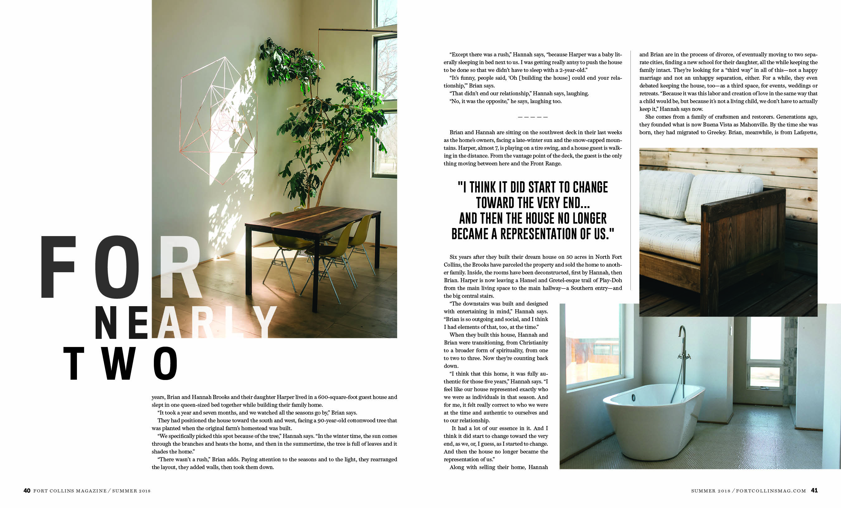
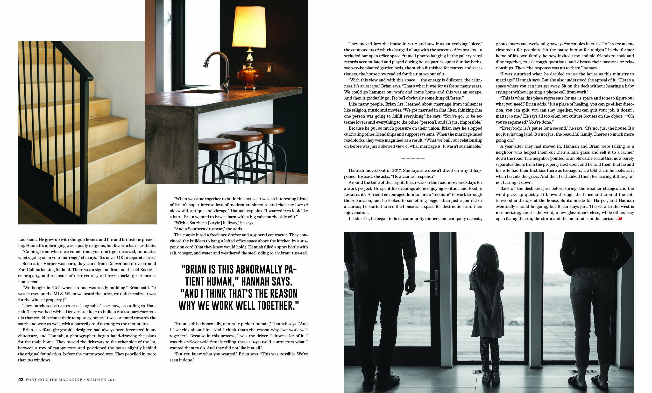
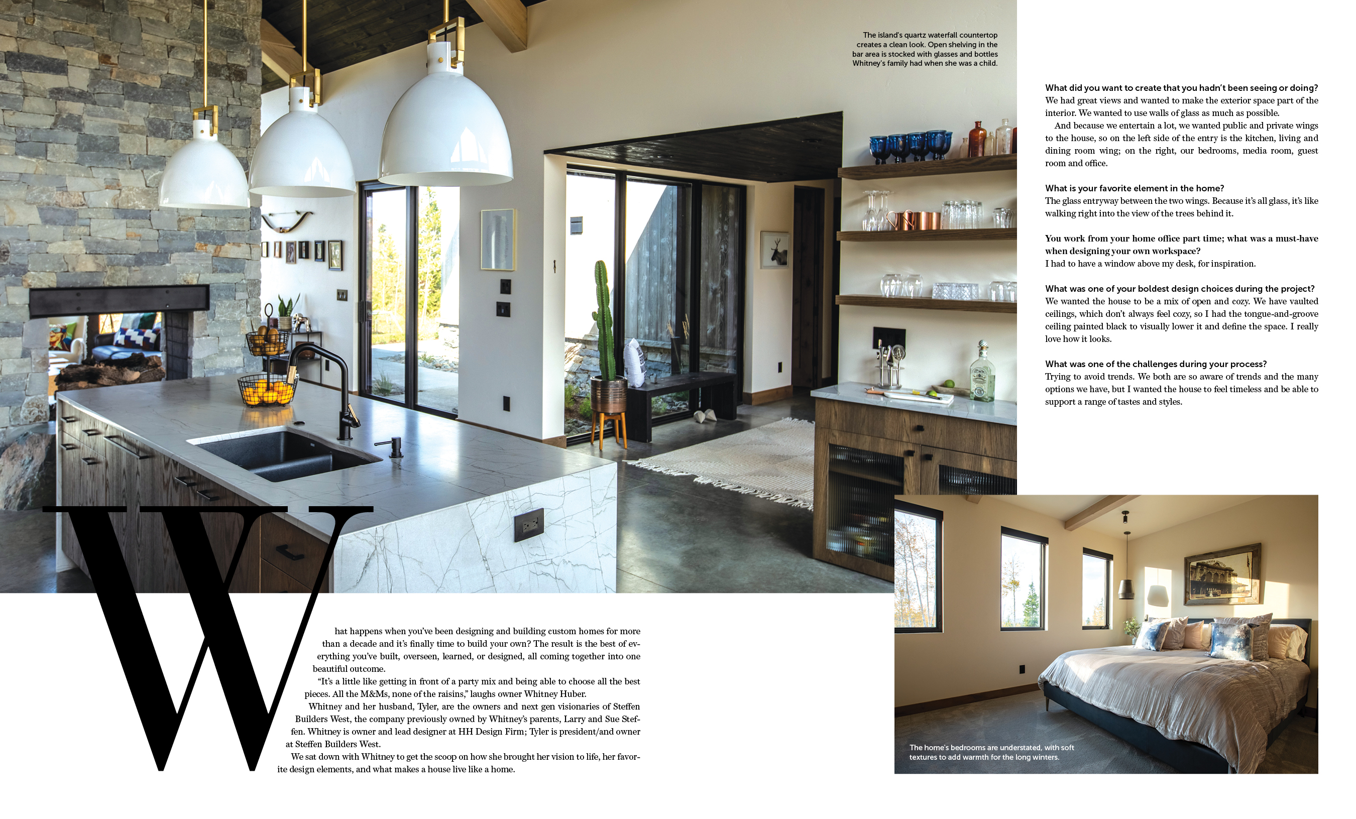
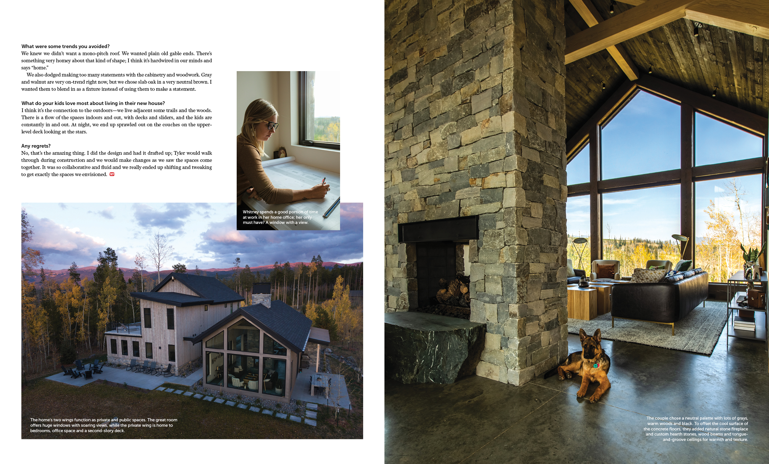
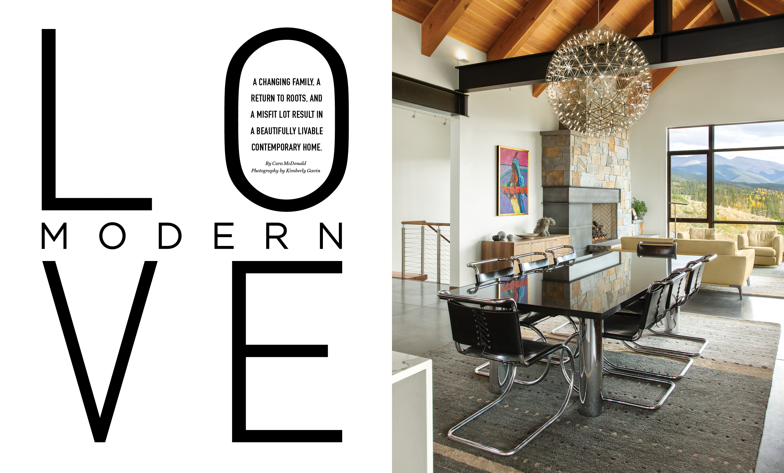
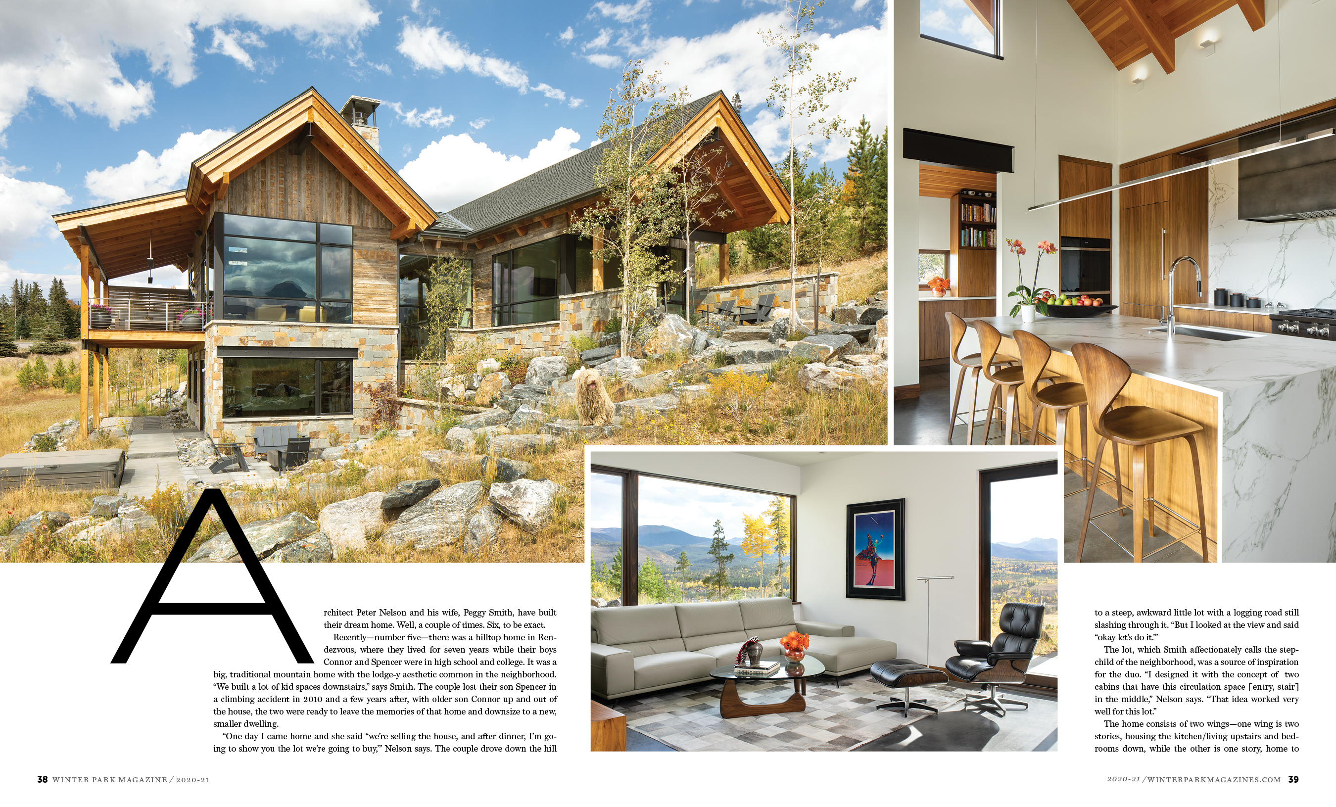
The home feature is probably my favorite layout. Not only did the photographer do an awesome job capturing the mood and essence of the story, but the article itself wasn’t the typical happily ever after story — which makes it an interesting read. This gave me the challenge of having to creatively reflect thatUsing the bold san serif font shows the seriousness of the topic, and giving it an opacity treatment is a metaphor of how the couple’s lives in the house is in the past. In the end, I’m really please with how it turned out.

FoCo Summer 18 P38-39FoCo Summer 18 P40-41FoCo Summer 18 P42-43

Latest Ft. Collins Magazine Designs

I can’t believe it’s been a year since my last post! Here’s my latest work for Ft. Collins Magazine. If you ever visit, be sure to grab a copy when you’re there or visit here to find out where to shop, eat and play!

Travel Feature Magazine Design

This is a feature layout I did for The Society Diaries, a high-end glossy magazine. When laying out a feature about a destination, I feel that the pictures should be the focus point and be able to speak for themselves. With this, the opener started with a two-page spread image with just the header and subhead. A few key words were highlighted in a complementary blue to make it a little more interesting than just keeping all the text white. Since the feature was about paradise in Hawaii, I felt it was important to keep the layout clean, simple and breathable. Ideally, I would’ve liked to have another spread just for the island photo shown on the second spread. It’s such a gorgeous photo and it encompasses the beautiful island of Hawaii. Overall, I’m really happy with how the feature turned out!

TSD JAN FEB 15 HAWAII FEATURE

TSD JAN FEB 15 HAWAII FEATURE1

TSD JAN FEB 15 HAWAII FEATURE2