Check out the latest Spring and Summer issues of Fort Collins Magazine.
This was the first time Fort Collins magazine did something super abstract for their cover. The Spring cover has at least five different images in it with a typography treatment on top of it. To give it a fun spring-like feel, I went for warm bright colors; but at the same time, kept some earthy-tones to reflect the brewery theme. I’m glad they went for it because I think it looks pretty neat!

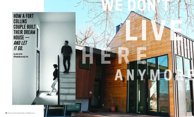
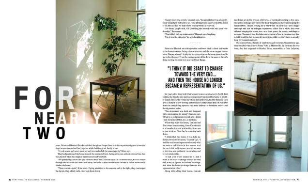
The home feature is probably my favorite layout. Not only did the photographer do an awesome job capturing the mood and essence of the story, but the article itself wasn’t the typical happily ever after story — which makes it an interesting read. This gave me the challenge of having to creatively reflect thatUsing the bold san serif font shows the seriousness of the topic, and giving it an opacity treatment is a metaphor of how the couple’s lives in the house is in the past. In the end, I’m really please with how it turned out.


5 thoughts on “Reasons to love North Colorado!”