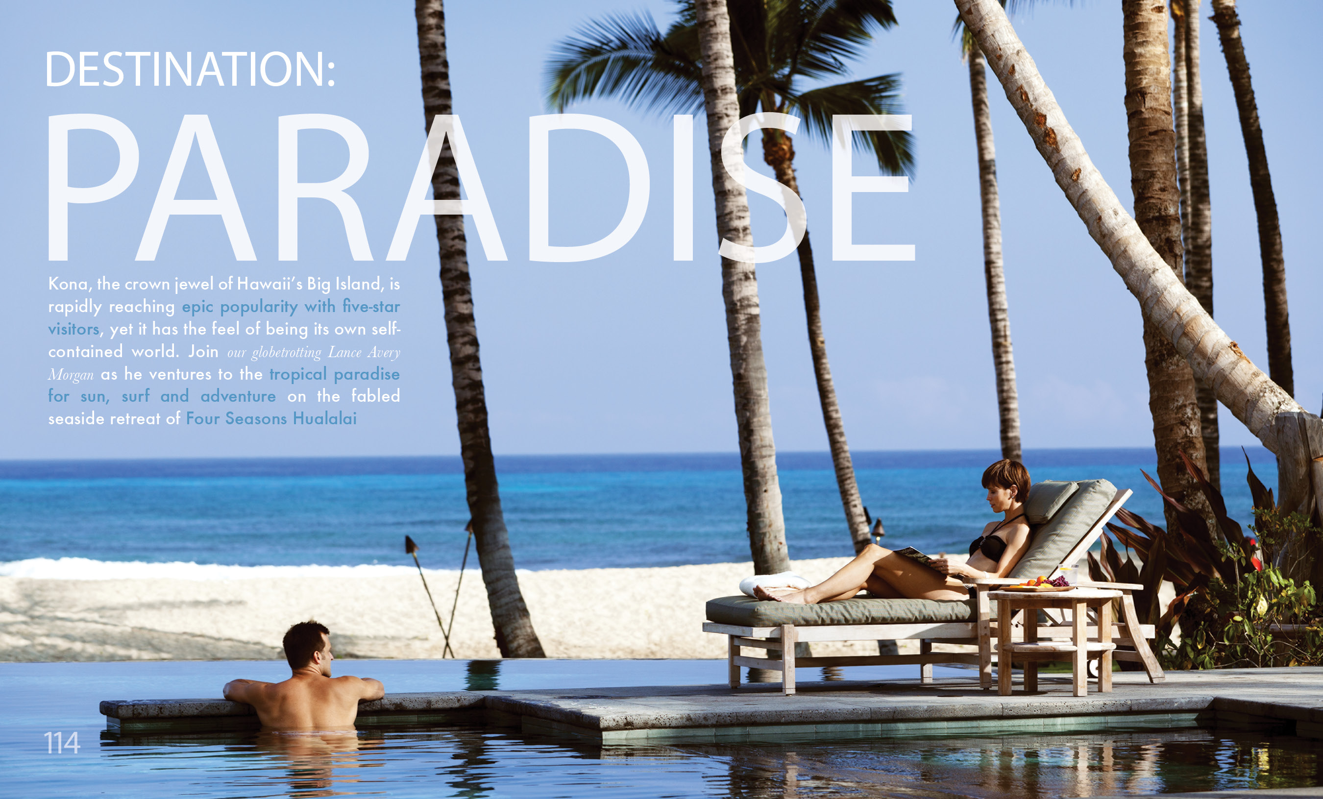
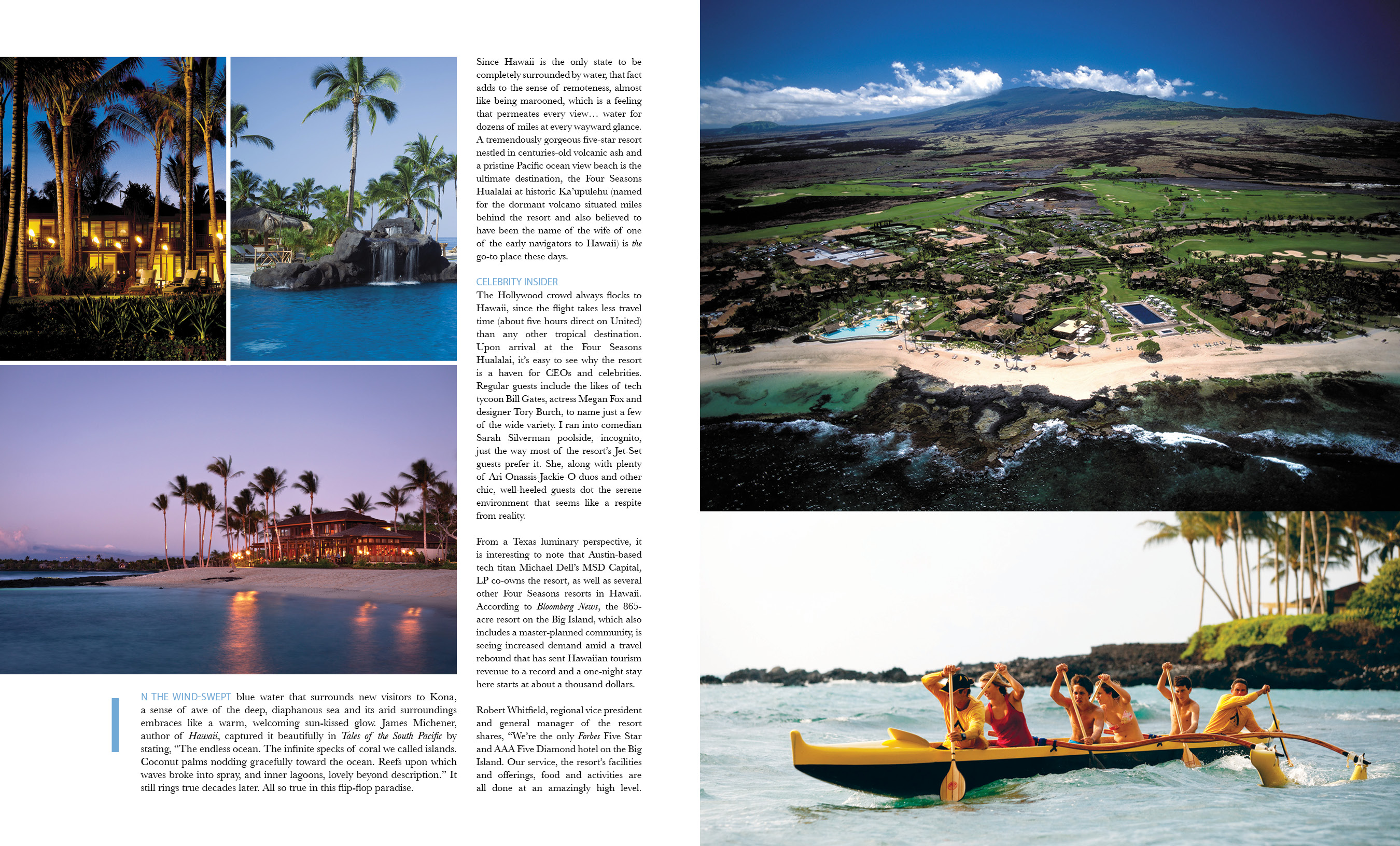
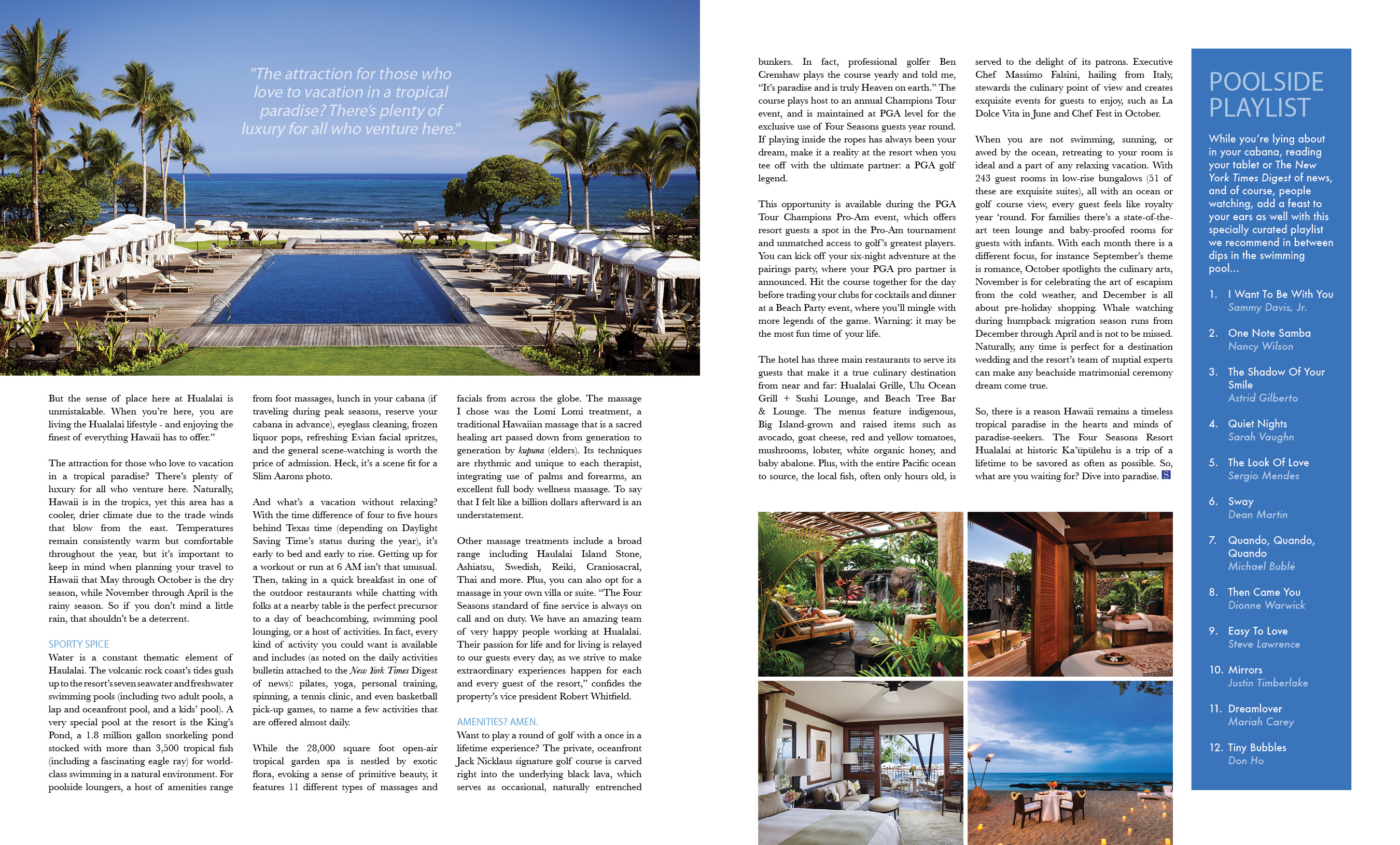
This is a feature layout I did for The Society Diaries, a high-end glossy magazine. When laying out a feature about a destination, I feel that the pictures should be the focus point and be able to speak for themselves. With this, the opener started with a two-page spread image with just the header and subhead. A few key words were highlighted in a complementary blue to make it a little more interesting than just keeping all the text white. Since the feature was about paradise in Hawaii, I felt it was important to keep the layout clean, simple and breathable. Ideally, I would’ve liked to have another spread just for the island photo shown on the second spread. It’s such a gorgeous photo and it encompasses the beautiful island of Hawaii. Overall, I’m really happy with how the feature turned out!